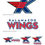
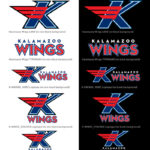
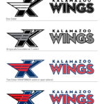
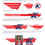
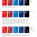
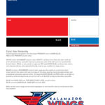
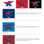
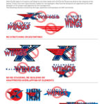
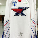
I was approached by the Kalamazoo Wings hockey organization, a professional hockey team located in my hometown of Kalamazoo, Michigan, to design a new identity and logo system for the team. The last logo system had been done in the late 90’s, and the organization wanted to refresh and revitalize the team’s look in tandem with the renovation of Wings Stadium/Wings Event Center. I worked with project manager/marketing consultant Karen Buczek and Greenleaf, the corporate owners of the Kalamazoo Wings, on finding a new visual identity for the Wings.
My direction on the design was to simplify and clean up the design, and to make it not reflective of trends, but more classic in look. Given the very wide range of requirements and uses of the identity, I wanted to keep it simple and easy to reproduce. I wanted the new mark to be sleek, fast, powerful and iconic; I also wanted to give the new mark a feeling of legacy, of referencing what had come before, but to also show the future of the team simultaneously. I also needed to make sure the identity differentiated itself sufficiently from the Detroit Red Wings. Being in the same state, I wanted to make sure the Kalamazoo Wings team looked and felt unique, and not a version of the Red Wings.
While sports fans are always very loyal to their team’s logos, I hope that my new logo is one that respects the proud legacy of the team, and gives the fans and players something that they can be proud of and get behind and support.
