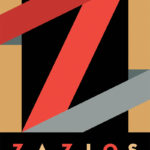
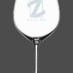
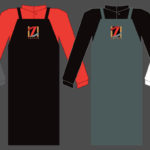
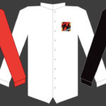
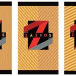
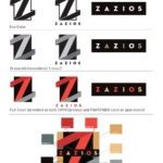
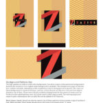
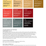
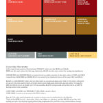
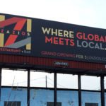
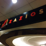
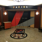
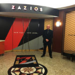
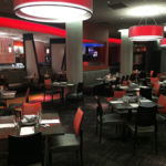
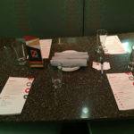
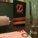
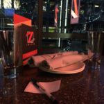
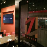
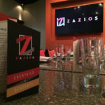
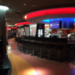
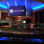
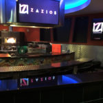
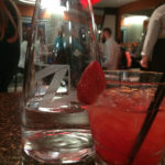
After working on the Kalamazoo Wings Hockey team identity re-design, I was again approached by Greenleaf Hospitalities, who own and operate all of the food vendors in the Radisson Hotel in downtown Kalamazoo, to help with the re-design of the identity for Zazios, one of three restaurants in the Kalamazoo Center. Zazios was opened in 2004, positioned as a restaurant/bar with an emphasis on martini culture and international cuisine. The revamp on the restaurant wanted to re-focus more on the Chef’s Table, a stadium style demonstration area where the head chef prepared food for patrons from locally source produce and ingredients.
Here’s the original profile of the restaurant: “Taste the Italian Flavors at Zazios, located on the lobby level of the Radisson Hotel, is a modern Italian experience where the food is the entertainment. Our contemporary design and aroma of succulent modern Italian cuisine set the stage for the memorable dining experience our cast and crew will provide. Our colors, curves and metal design, accompanied by our intriguing and experienced staff, will keep you entertained. We accept reservations for our Chef’s Table that begins nightly at 6:30pm. Our Chef’s Table offers a five course meal for up to 12 people in a stadium style seating environment.”
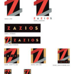
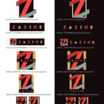
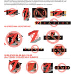
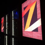
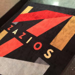
My brief was to work to achieve a identity system that would get across the sophistication of the cuisine, but to also make the venue approachable and position it as a mid-range but high class destination. Working with marketing consultant Karen Buczek, I investigated a wide range of directions, looking to differentiate the look and feel of the system from other local restaurants, but also making it have a design that would not become dated by not leaning heavily on current trends. As with all designs, I wanted to keep it simple, so that it would work in the absolute simplest formats, but also allow it to grown and adapt with the needs of the organization.
